Wednesday, 9 May 2012
Wednesday, 14 March 2012
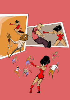
part of this project is to do an ultimate image. i need to tie it in with the comic i think. its showing my work and its part of the university. so im thinking of doing a step by step. pencil. then inked then photo shopped. this image. it could even be the front cover to the comic or the centre page pull out. i just really like itand it shows off what i can do
this is sequentialy page 4 to 10. i think its reading like a comic. there will be different colour to the backgrounds, symbolising each character. black for lucious lighter for kat inbetween for michael, more vibrant in the fight scenes. i prefer the work in black and white. but its a comic and it needs colour.
Wednesday, 29 February 2012
this sequence introduces lucious vent. the genius. the meglomaniac the madman. its over 3 pages. showing his public persona, his aragance and his fragile mind. i like this sequence. it works. its what i shud have done with the other pages. its flowing better. it starts, introduces, gives a snippet of the character. cant wait to get colour on theese buggers now. more to come soon. need some feed back tho.
its been a while. ahh january u horrible month. february too. anyway ive been busy. ive started this comic idea. heres page 1. in its final cleaned up version and ruff directed version. its an opening scene, set in a hospital. but i dont know if it it establishes it. do i need to show an opening shot of a hospital. or do i grant the readers some respect and asume theyl guess? hmmmm. comments please
Thursday, 19 January 2012
i looked over some different steam punk images. there the obvious victorian look. but i didnt want it to be obviously victorian. imagine that steam punk has moved on. evolved. i thought to keep its feel look back at other iconic architecture. art deco works. steam punk art deco style. its evolution dont you know
theese are just different shapes im working with. as its a post modern steam punk world. i like the idea of victorian brick/ terraced look. but emcompass the modern. i imagine the world to be shrouded in a mist. so maybe big circular domes on top of roofs for people to see out of the houses. just an idea
Subscribe to:
Comments (Atom)


